The Task
To design a “recommended recipe” page for a service called Eat Well where customers send in a blood sample, record basic information about themselves, and the service recommends recipes and diet changes to improve health and cognitive ability based on the output from Eat Well’s AI. The service is geared for 18-35 year olds who are interested in nutrition, but do not know a lot about it. The goal of this page is to show the customer the recipe and why it’s recommended, while making it easy to understand.
My Process
I started from the very beginning and conducted market research to see if there are any competitors on the market or some other services with similar functionality. As soon as I gathered that information, I realized that this kind of service is unique! I then proceeded with brainstorming the core features of Eat Well on paper, finding out more about the target users and what kind of information they would be interested in. One of the key challenges I faced was finding a way to present this information while emphasizing the competitive advantage of this service – the recipes were highly personalized and suggested by an AI using user’s blood test results!
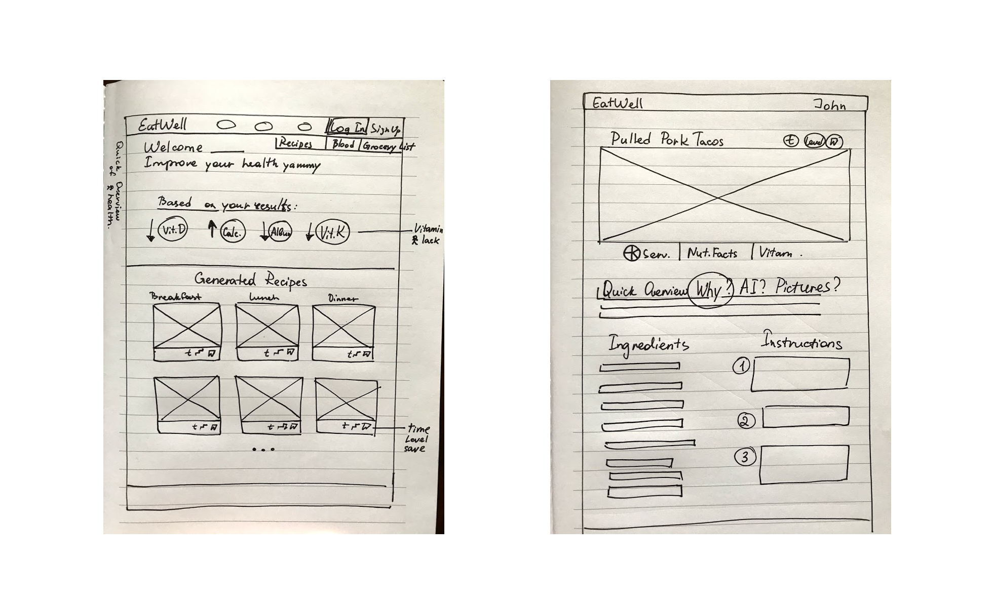
As I had a tight deadline for this project, I did not have much time to spend on user testing. I walked into the nearest coffee shop and asked random people what their general thoughts were on the very early paper prototypes. After talking to them, I realized that the page was too similar to an ordinary recipe website that had no other unique features. People didn’t understand how blood samples were linked to it!
In the next iteration, I put the AI feature first: I wanted to show WHY these recipes were generated and HOW they can improve users’ health.
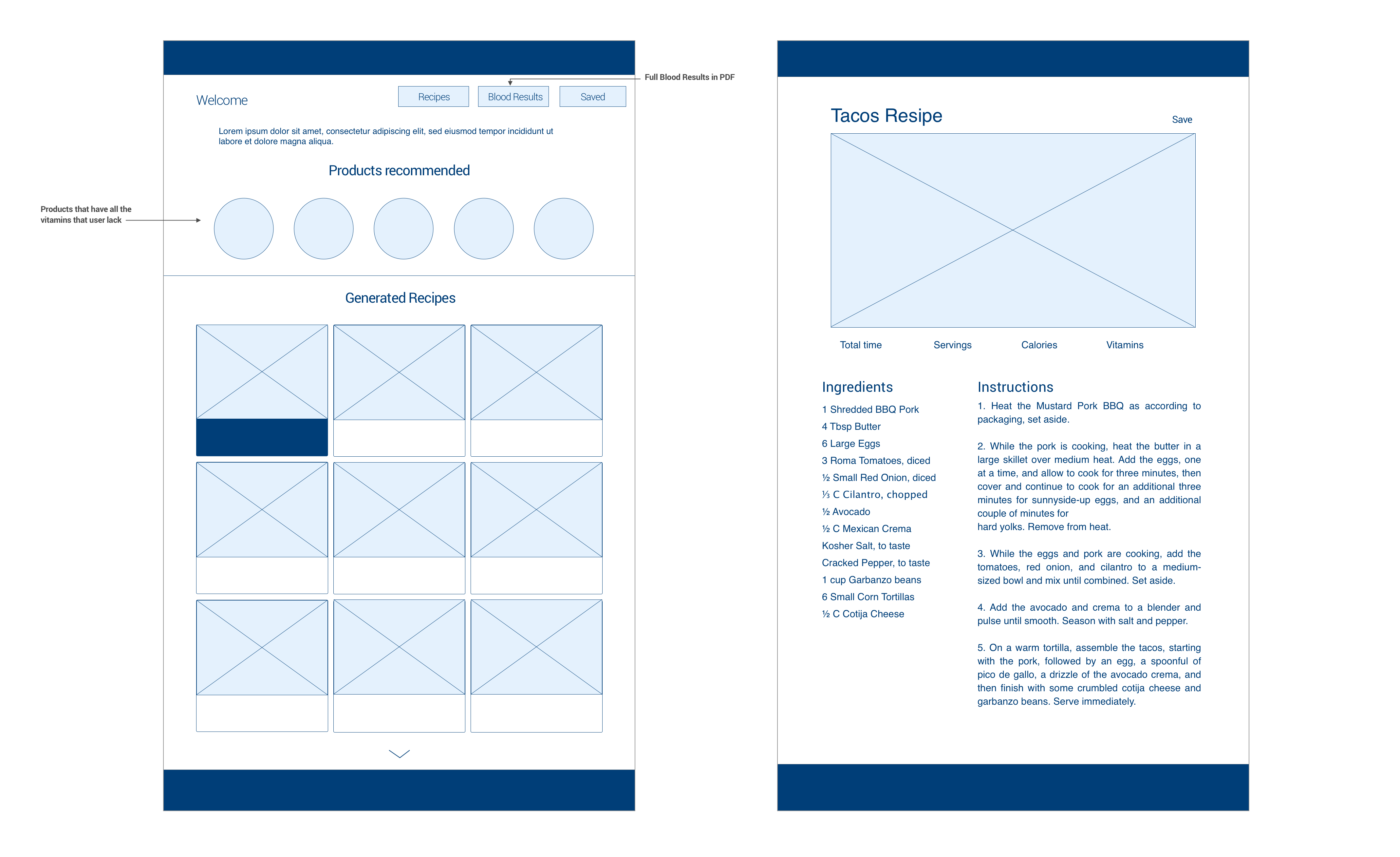
I have already picked a primary color for the design in my head – since I wanted to link the color to blood and appetite, I had to go with a shade of red. A problem I immediately encountered was that many people associate red with something aggressive or error conditions. As a result, I just played with this color and created a dark pink tone that is a great fit for the design!
Since each food has a different amount of needed vitamins, I decided that this website needs to have its own score system (the EatWell score), which will be generated by the AI. I put this score in the ” Generated Recipes” box, so the user could see all the advantages of the dishes before he/she clicks on it.
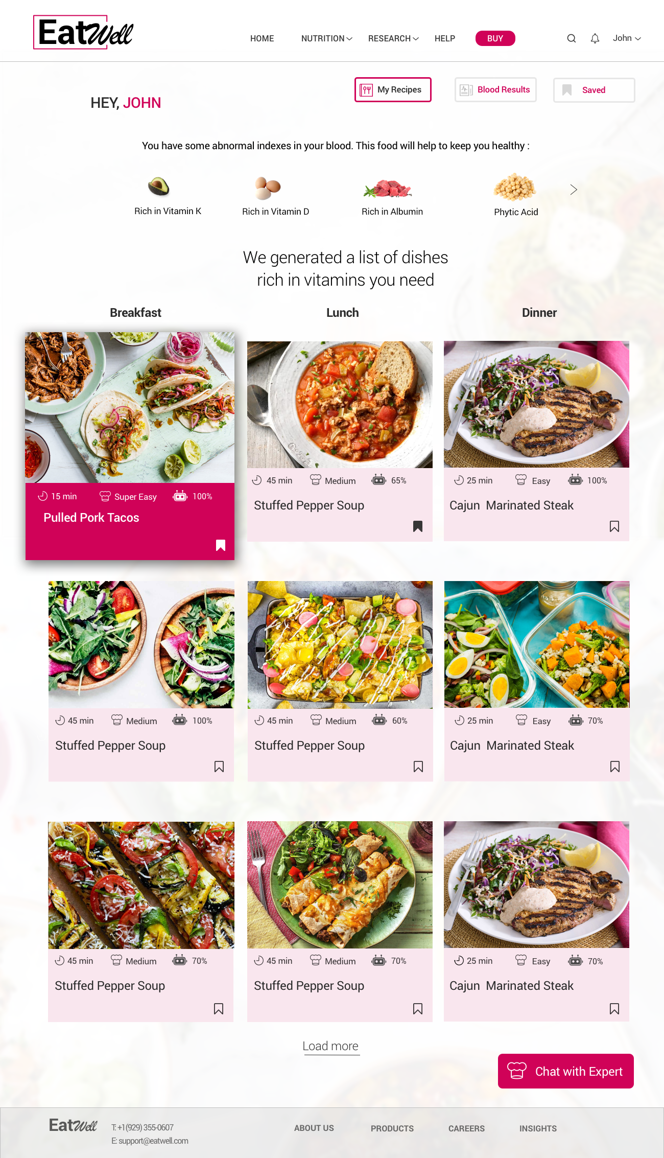
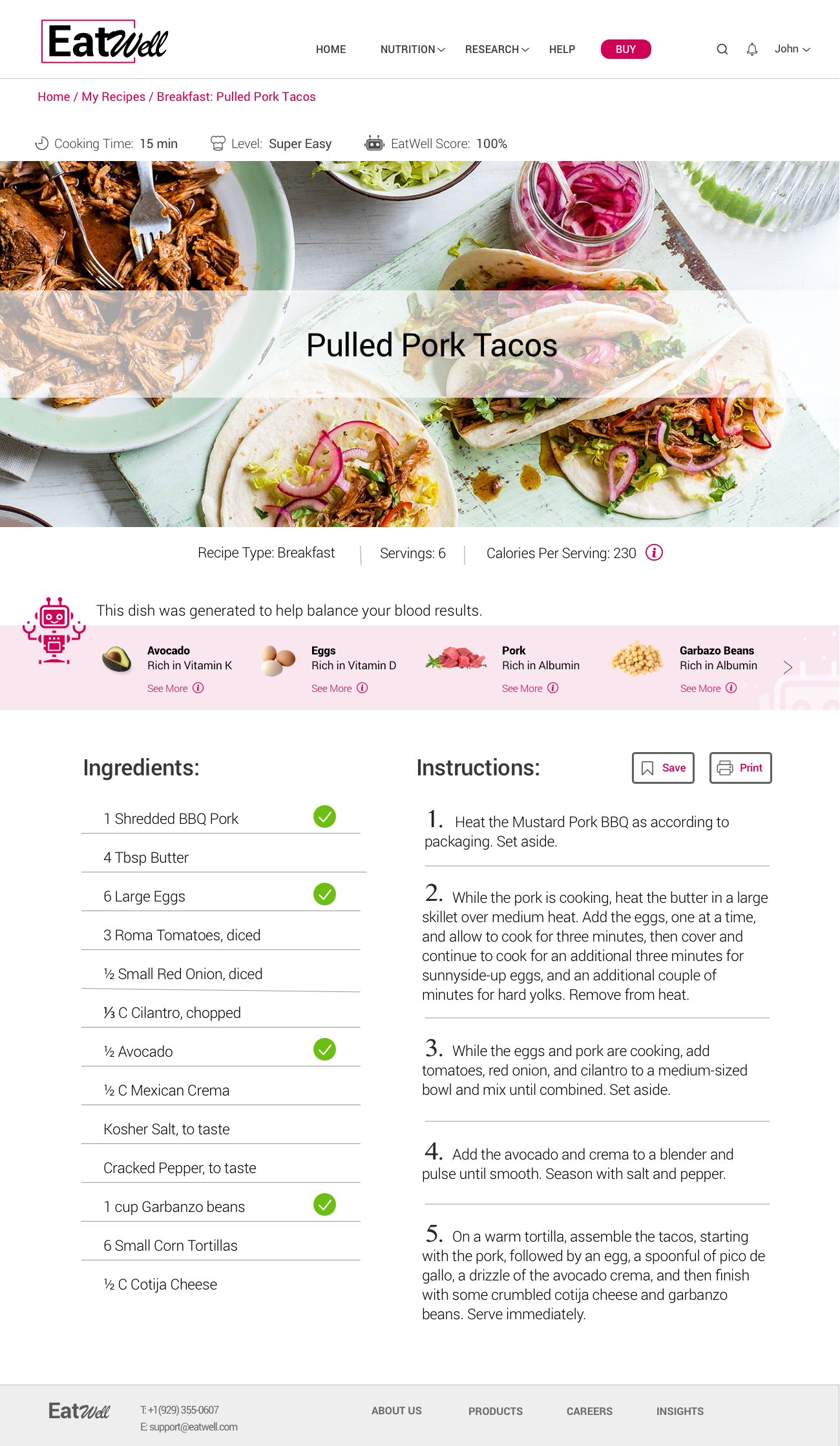
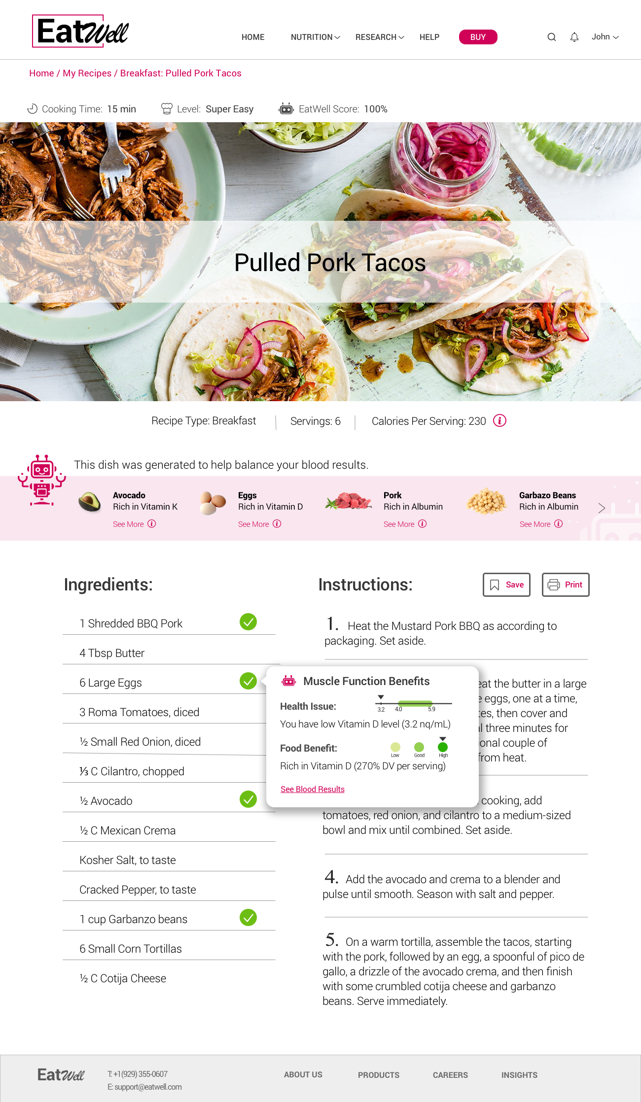
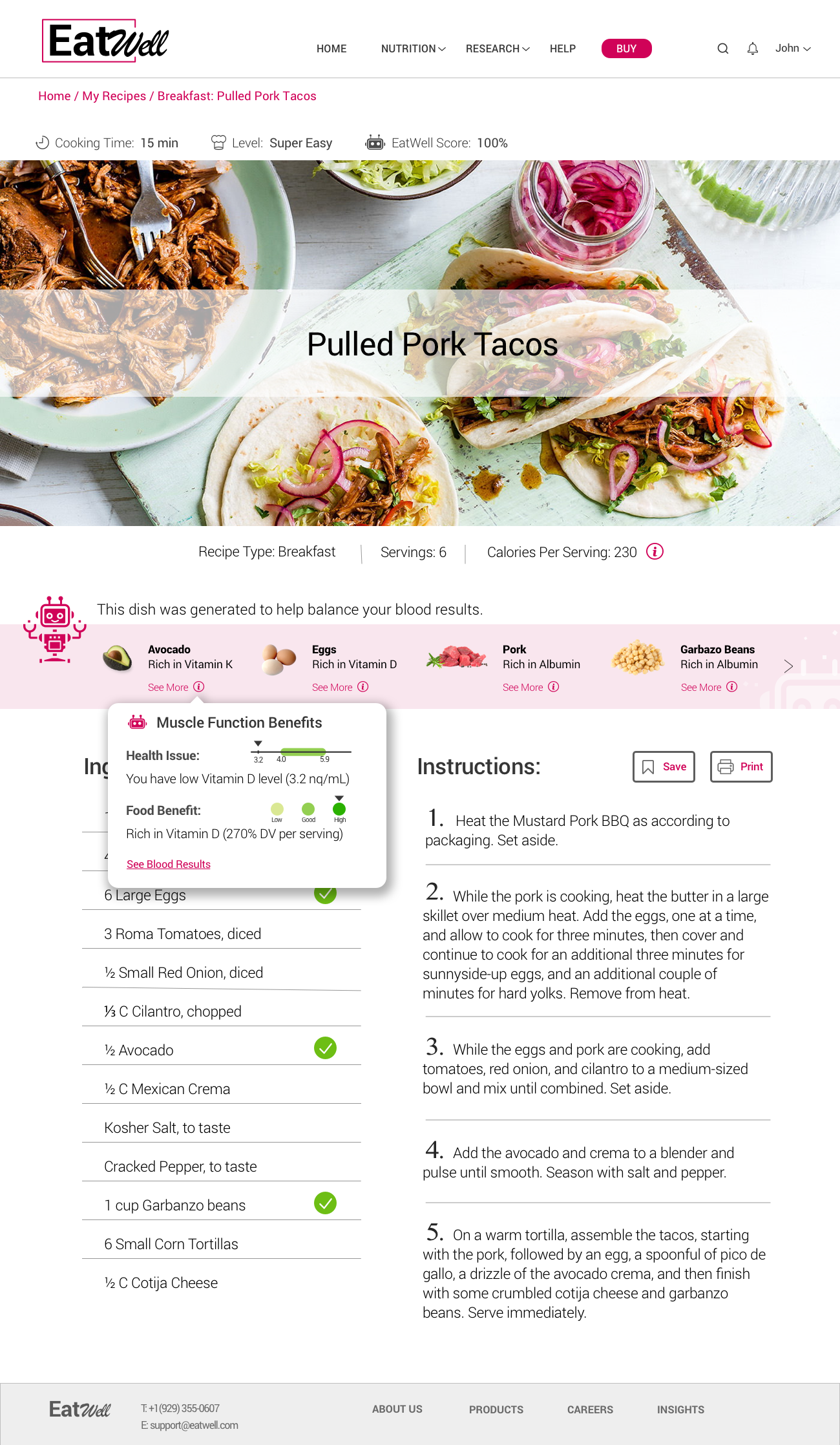
I wanted to keep the Recipe page clean and fresh, but also make the information scannable, so the user could grasp it from the first glance. I made checkmarks in front of key ingredients that have vitamins a user needs, that are also can be viewed on the top of the instructions. I wanted to put the information about each key ingredient as well, describing food main benefits and how they can improve user’s health. As a result, I came up with a tooltip feature. It shows all the information about peoples’ current health situation (health issue) and the food advantages. I wanted to keep it visually attractive, easy and understandable, and that’s how I came up with this visualization:
