This was a Capstone Project for a micro-degree Interection Design Specialization at UC San Diego.
How it all started
The idea for this app came from my personal frustration with the way the credit card system works. As I started using different credit cards, I realized that it was extremely hard to control and keep track of my balances, especially for several cards from different banks. All banks had their own, unique apps that worked differently from each other. The type and quantity of information, as well as the way it was presented was not consistent at all. It was hard to see all of my transactions in one place, spending trends over time, set budgets and track spending in various categories such as groceries and transportation. None of the other apps I explored had a good solution for these problems. Some of them showed only transactions with budgets, others showed some basic trends which were hard to read, but none provided all of these features in a nicely designed package. This is where the core idea behind the BusyBee app came from.
I chose to focus on improving existing features from the other apps and adding some new ones that are really needed. My tutors for the capstone project proposed 3 major design briefs: TIME, CHANGE and GLANCE. I’ve decided to design a solution around CHANGE with GLANCE transition.
Ideation & Needfinding
People often forget about things they bought or price they paid for services during a month, and after recognizing a strange transaction they need to call the bank, taking precious time out of their day long to prove that there was a mistake or even credit-card fraud. But what if the person loses his receipt and the merchant refuses to cooperate? This process turns into real stress.
When you have several different credit cards and debit cards, it is hard to keep up with all the transactions you do daily. Also, not only in the USA, but all over the world, hackers and scammers can steal your bank account and use your money. It is vital to be ready for quick action.
To make sure that my needs represented the needs of other people too, I decided to approach this using the ideation and need-finding techniques I learned in my UX Design specialization. I spent some time with my users from various social, age and national backgrounds. I got to know them through some formal, videotaped interviews where they answered questions about their credit card use and how they solved the problems I identified. It turned out that everyone felt the same frustration that I did and there was no good solution that they could use! After gathering all these observations, I brainstormed some ideas and areas for improvement.
My core idea was to improve and simplify the use of financial apps by:
- Creating a clean and simple UI that shows trends, statistics and budget charts for personal awareness and helps users keep track of their spending patterns over time
- Making all the expenses transparent with detailed information
- Making it super easy to identify fraud and unusual transactions
- Making automatic category determination + ability for customizing them
- Adding features that categorize all transactions by type and allows the user to track his/her monthly budgets in those categories
- Adding a feature to set a separate budget for any of the categories
- Allowing users to stay connected with their money, even if they use credit cards from different banks
- Tracking credit score over time and correlating it with user’s spending patterns
- Overall, the application aims to be clean, convenient and easy to use!
Storyboards & Prototypes
From my point of view, a good financial app has to be able to show clean and easy-to-understand charts and trends, detailed transactions, allow you to quickly switch between cards from different banks and automatically send your location to the bank to prevent the card from getting blocked during travel.
I created a few storyboards outlining user needs:
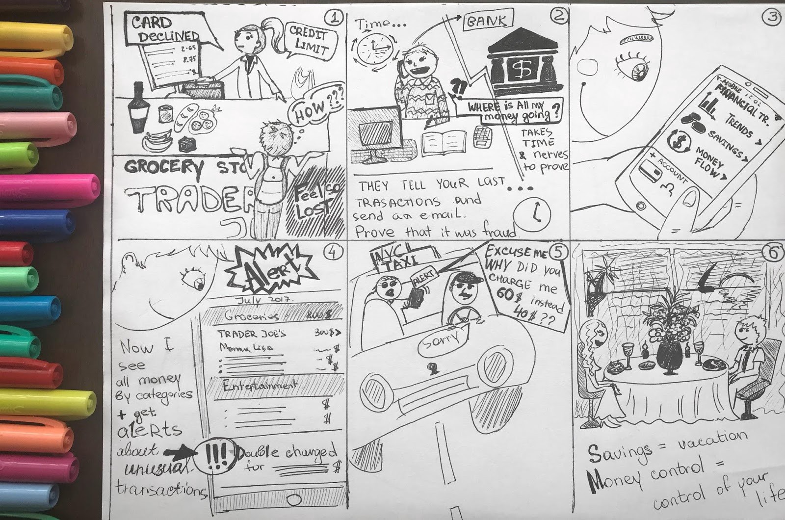
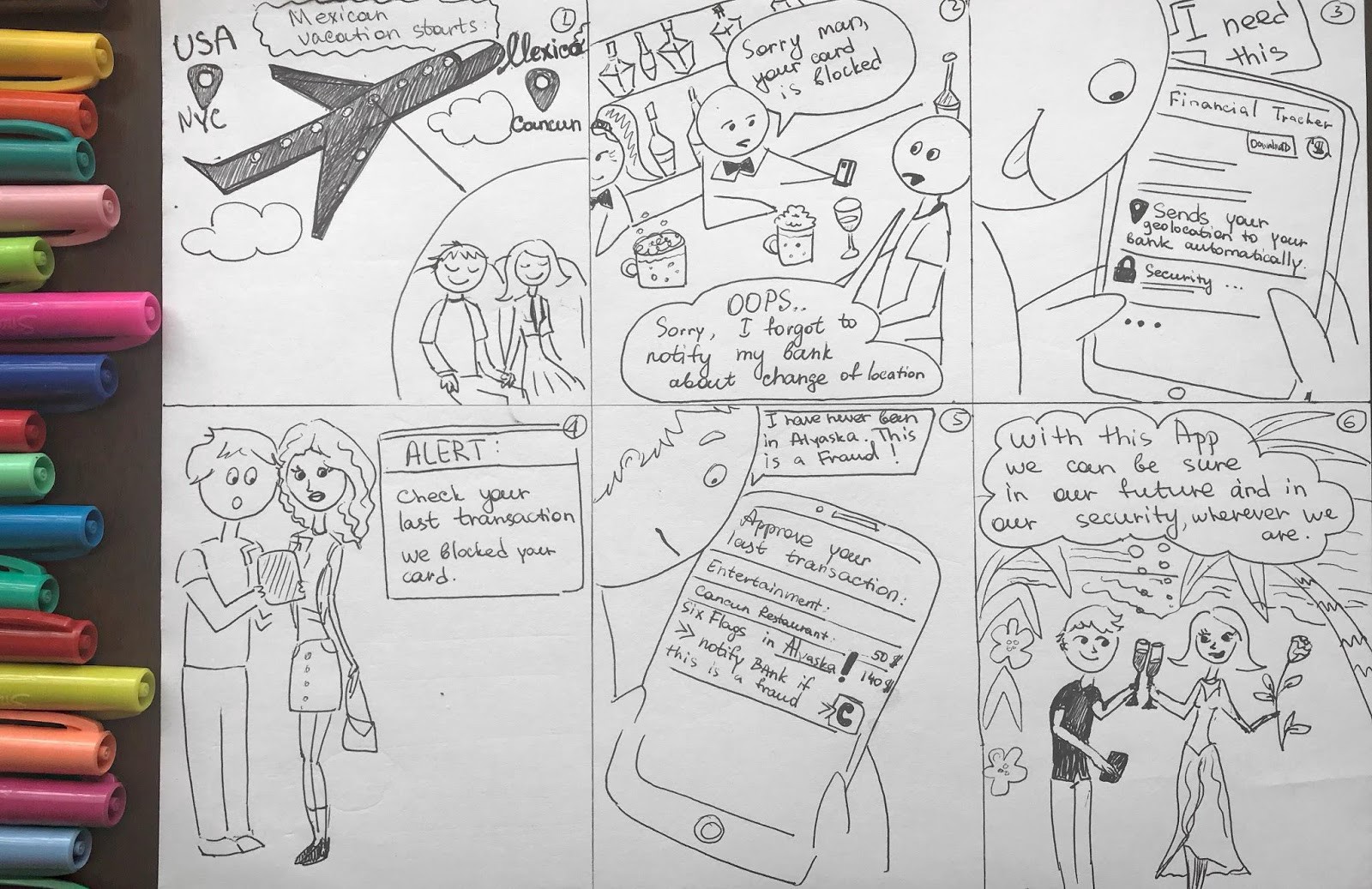
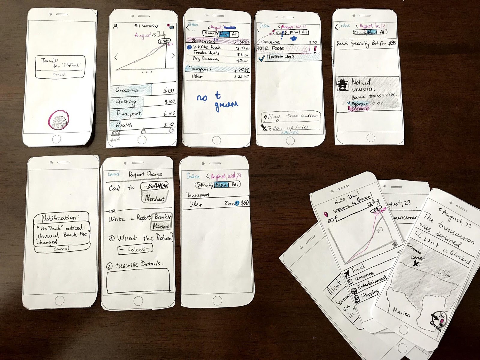
After doing some planning, I created a paper prototype and made it interactive using PopOut by Marvel. This helped me visualize what users would need to do and how the UX design would provide a solution for that. This was only the first version and like in all lo-fi prototypes some things were not fully thought through and lots of things were left for later.
Before final user testing, I needed to run the design through a heuristic evaluation. Based on industry standards, HE helped me solve some basic problems. It was time to make corrections and improvements.
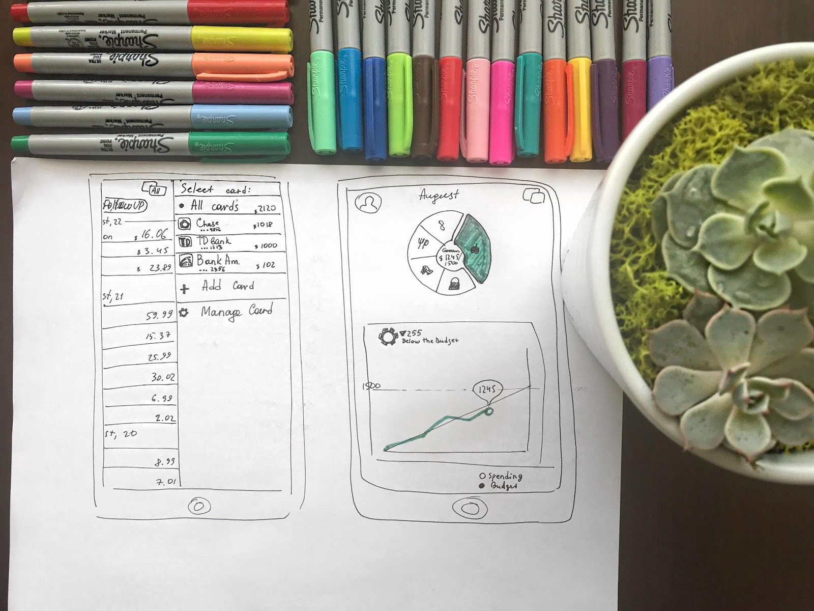
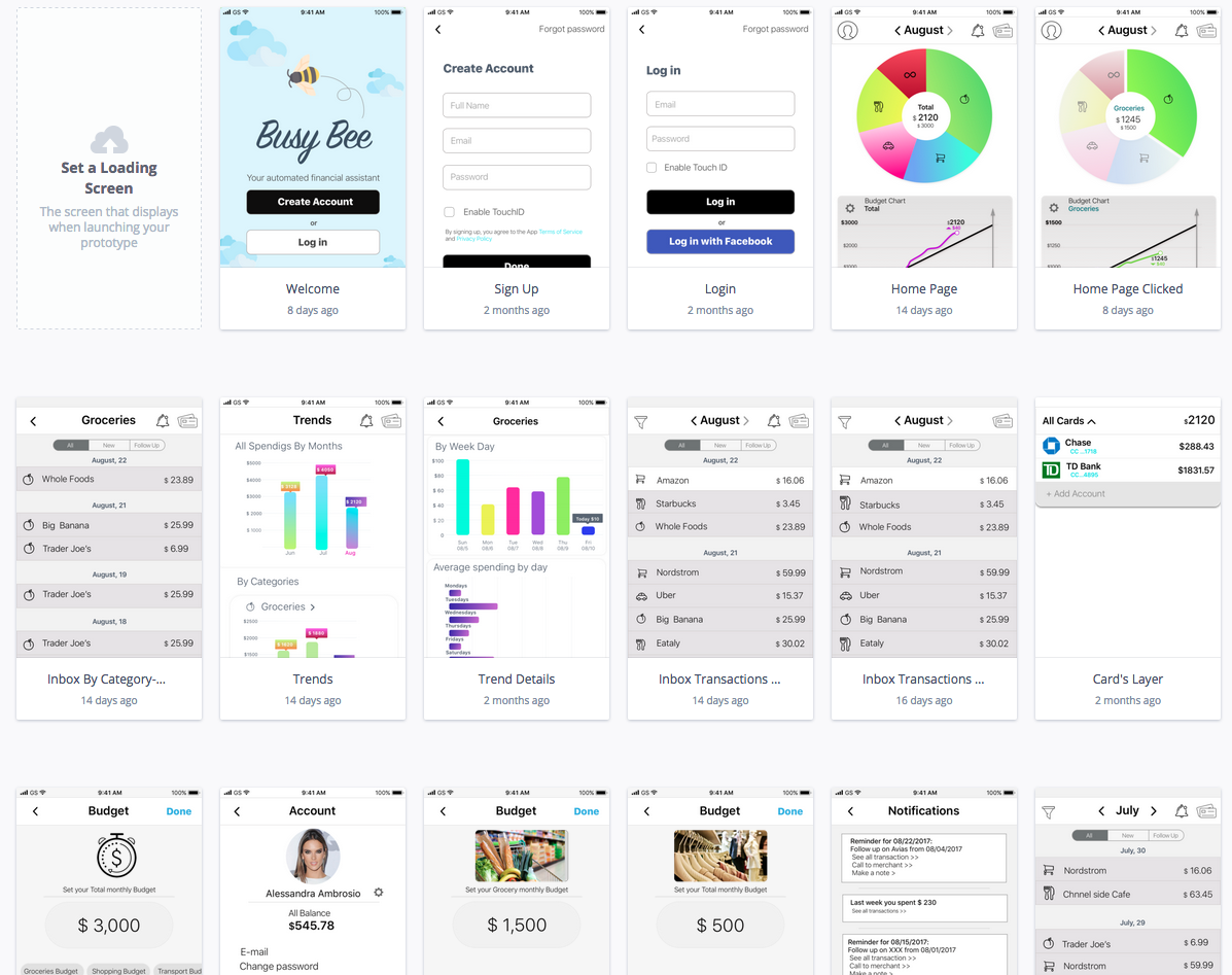
Finally, it was time for a high-fidelity prototype. I created mine using Sketch and Invision through Craft.
User Testing
Once I got my prototypes with the main features covered, it was a time to run A/B testing. I did mine through User Testing.
Selecting the current card is very important for filtering the transactions you want to see and I couldn’t decide what version of “credit card menu” to use, so I wanted my users to compare these 2 versions:
- Drop-down menu, where the user can select to show “All Cards” or any other card separately, just clicking on it.
- Side menu, sliding out from the right, with the same functionality.
Actually, this was one of my favorite parts as it allowed me to see how real users are using my app! I was happy that users’ feedback and reactions were very positive. They said this app will become very popular and successful in today’s busy world.
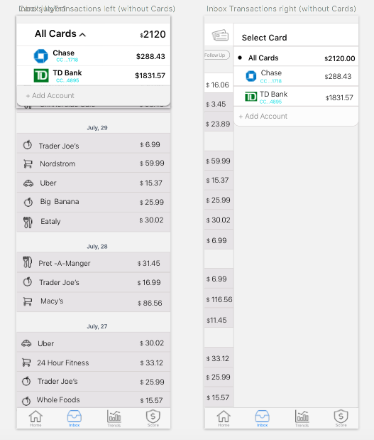
3 users out of 4 said that drop-down menu looks cleaner and easier in use. Besides, they said that such type of layout reminds them of other apps that they use every day. So I made some changes for the final version.
Final Product/ Overview
A few iterations and user tests later, I’m happy to present to you the final design that I settled on! Of course, there are lots of things to work on, but I am just happy to show you what I got so far.
https://projects.invisionapp.com/share/PQFIB4A65GX
Overall, the application aims to be clean, convenient and easy to use. If you’d like more insight into where your money is going, BusyBee is a must have app for you!
Throughout this course, I have learned a lot of valuable knowledge and would surely continue to use all of it with my work as a UX Designer.
Thank you Professor Scott Klemmer, Professor Elizabeth Gerber, Professor Jacob Wobbrock,and the UCSD Design Lab for making IxD Specialization so interesting and accessible!